Mi sobrina me pidió el invierno pasado que " hacer que su tarea pareciera escrita a mano" para poder saltarme una página de copia. Dije que no, pero la solicitud me envió por una madriguera de conejo, porque yo ' Acabo de conectar una herramienta de texto a escritura a mano a Toolz.dev y quería saber exactamente qué tan convincente era en realidad. Así que me senté allí durante una hora escribiendo párrafos, recorriendo fuentes, imprimiendo páginas de prueba en la impresora láser de la oficina y sosteniéndolas junto a mi propia letra realmente horrible.
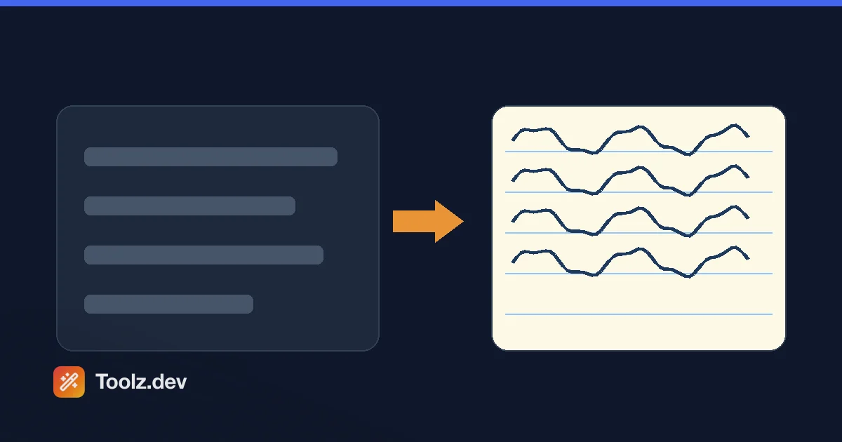
Esto es lo que aprendí, y es lo que la mayoría de los artículos sobre estas herramientas no te dirán: un convertidor de texto a mano no es simular una mano humana. Está renderizando un Fuente estilo escritura a mano sobre una imagen. Esa distinción importa mucho para lo que puedes y no puedes salirte con la tuya, así que voy a ser honesto al respecto en lugar de venderte magia.
los Convertidor de texto a escritura a mano es realmente útil para lo que es: rápido, privado y gratuito. Escribes, eliges un vistazo y descargas un PNG. Déjame mostrarte cómo funciona realmente bajo el capó, qué hacen las 15 fuentes y 8 papeles, y en qué lugar se desmorona la ilusión cada vez.
TL;Dr: La herramienta dibuja su texto con una de las 15 fuentes reales de Google estilo escritura a mano en un lienzo, luego le entrega un PNG. Elija una fuente, un color de tinta, un tamaño de fuente y un estilo de papel (lineado, gráfico, crema, cuaderno), escriba o pegue su texto y descargue. Es genial para invitaciones, notas, publicaciones sociales y maquetas. será no engaña a cualquiera que mire de cerca, porque es una fuente, cada letra "e" es idéntico byte por byte. Emparejarlo con el Contador de palabras para mantener una página legible.
¿Cómo funciona realmente un convertidor de texto a escritura a mano?
Elimina el marketing y sus cuatro pasos, todos funcionando en tu navegador:
- Cargue una fuente de escritura a mano. La herramienta extrae un conjunto de tipos de letra estilo escritura a mano de Google Fonts, como Caveat, Dancing Script y Patrick Hand. Estas son fuentes reales dibujadas por diseñadores tipográficos acechar Casual y dibujado a mano.
- Dibujar texto en un lienzo. Su texto se envuelve y se pinta en un HTML
<canvas>en compañía dectx.fillText(), en la fuente, tamaño y color de tinta elegido. - Pinta el papel debajo. Antes del texto, el lienzo obtiene un fondo: un color de papel y, opcionalmente, líneas regladas, una cuadrícula o un margen de cuaderno.
- Exportar un PNG. El lienzo terminado se guarda a través de
canvas.toDataURL('image/png')y descargado.
Eso es todo. No hay IA, no hay simulación de trazo, no hay fluctuación por letra. Y ese último punto es toda la historia, así que sentémonos con ella.
Por qué nunca se ve escrito a mano (la parte honesta)
La escritura a mano real es inconsistente. Tu "a" en línea uno es un poco diferente de tu "a" en línea cuatro: inclinación diferente, presión diferente, una oscilación aquí. Esa inconsistencia es exactamente lo que usa tu cerebro para decidir " un humano escribió esto."
Una fuente no puede hacer eso. Cuando la herramienta dibuja la palabra "banana", los tres glifos "A" son idénticos a los píxeles, porque son el mismo glifo del mismo archivo de fuente. Los borradores cuidados de este artículo (incluido el que reemplacé) reclamaron que estas herramientas agregan "variación a nivel de personaje" y "imperfección controlada". Esta no es así, y, sinceramente, la mayoría de las herramientas del navegador no. lo que obtienes es una letra muy bonita tipo de letra, no una falsificación. Sostenido a la distancia o encogido al tamaño de Instagram, se lee como escrito a mano. Bajo el ojo de un maestro o de una lupa, las letras idénticas que se repiten lo revelan al instante.
Así que úselo donde la ilusión sólo necesita sobrevivir a una mirada (decoración, estado de ánimo, personalidad), no donde alguien la vaya a examinar como caligrafía genuina.
¿Qué puedes personalizar?
Más de lo que esperas para una herramienta de navegador gratuita, y todo en vivo mientras escribes.
15 fuentes de escritura a mano. El set va desde ordenado y legible hasta suelto y parecido a un marcador: Gloria Hallelujah, Caveat, Dancing Script, Pacifico, Satisfy, Great Vibes, Kalam, Patrick Hand, Indie Flower, Shadows Into Light, Permanent Marker, Architects Daughter, Handlee, Nothing. Podrías hacer y Reenie Beanie. Ellos' Son todos escritura latina y familia cursiva, pero visualmente abarcan una amplia gama: Great Vibes es una caligrafía elegante, Permanent Marker es una punta de fieltro gruesa, Patrick Hand es un elegante estilo de impresión cotidiano.
8 colores de tinta. Negro oscuro, azul, azul oscuro, rojo, verde, morado, marrón y gris: colores de bolígrafo realistas en lugar de un selector a todo color. El azul y el negro oscuro cubren la mayoría de los usos en el mundo real; El marrón se lee cálido y vintage para invitaciones.
10 tamaños de fuente, desde 12 px hasta 40 px en pasos fijos. Los tamaños más grandes se ajustan a menos palabras por línea, pero se leen mejor cuando se imprimen.
8 estilos de papel. Aquí es donde se establece el estado de ánimo: blanco liso, forrado en crema, forrado en crema, almohadilla legal amarilla, forrado azul, papel cuadriculado y un estilo cuaderno con un margen rojo regla en la izquierda. Los papeles forrados y de cuaderno venden el "desgarrado de un cuaderno"; el papel cuadriculado se adapta a cualquier cosa técnica.
También obtienes tres formas de ingresar texto: escríbalo, cargue un archivo de texto o cárguelo desde una URL. La altura de la línea se fija en un cómodo 1,8, por lo que no hay ningún control deslizante de espaciado de líneas o letras con el que jugar: una simplificación deliberada, no una característica faltante.
¿Para qué deberías usarlo?
Buenos ajustes, en orden áspero de lo bien que se mantiene la ilusión:
- Invitaciones y tarjetas. Boda, cumpleaños, baby shower: texto breve, contexto decorativo, visto casualmente. Este es el punto óptimo. Great Vibes o Satisfy sobre papel crema luce realmente encantador.
- Citas en redes sociales. Destaca una afirmación o cotización manuscrita en un feed de fuentes del sistema. encogido al tamaño del teléfono, nadie está contando sus "e" idénticos.
- Maquetas de diseño. Necesidad de mostrarle a un cliente lo que una anotación escrita a mano quería ¿Te pareces antes de encargar letras reales? Dos minutos aquí supera una hora en Illustrator.
- Notas personales y etiquetas de regalo. En juego bajo, cálido, divertido.
Donde yo 'd te aleja: cualquier cosa que tenga que pasar como escritura genuina bajo escrutinio - tarea que hiciste't escribir, "firmado" documentos, notas falsificadas. Más allá de la ética, simplemente ganó' Sobrevivir a una mirada cercana, por lo que tú' estaría arriesgando mucho por una ilusión que no 't sostener.
Una nota sobre esa insignia de "multipágina compatible"
Honestidad total, porque construí esto y prefiero que lo escuches de mí: el área de entrada muestra una insignia verde de "múltiples páginas", pero lo que realmente produce la herramienta es una PNG único alto que crece hacia abajo a medida que agregas texto. No se divide el contenido largo en imágenes de página separadas del tamaño de una carta. Para un párrafo o una nota corta que está bien. Para un documento genuinamente largo, obtendrás una tira muy larga, y querrás dividir tu texto en fragmentos y exportarlos por separado. Está en mi lista hacer que la paginación sea real; por ahora, planee una imagen por exportación.
¿Qué fuente se adapta a qué ocasión?
La fuente hace más trabajo pesado que el papel o la tinta, por lo que vale la pena combinarla con el trabajo en lugar de agarrar el primero de la lista. Después de mi hora de pruebas de prueba, aquí está más o menos cómo ordenar los 15:
- formal y bonita- Grandes vibraciones, satisfacción, guión de baile. Fluido, conectado, adyacente a la caligrafía. Invitaciones de boda, tarjetas de agradecimiento, cualquier cosa que quiera sentirse especial. Great Vibes en particular se lee como un guión real de un vistazo.
- todos los días legible- Advertencia, Kalam, Patrick Hand, Handlee. Impresión humana ordenada, legible y creíble. Mejor cuando las palabras importan más que la floritura: notas, subtítulos, mensajes más largos.
- suelto e informal- Flor independiente, Sombras en la luz, Gorro Reenie, Hija de arquitecto, Nada que puedas hacer. Relajado, un poco desordenado, personal. Ideal para una nota amigable o un diseño estilo diario.
- declaración audaz- Marcador Permanente, Pacífico, Gloria Aleluya. Espeso, de alto impacto, tipo cartel. Úselo para una sola línea o un titular, no para un párrafo.
Un consejo rápido que me ahorró una reimpresión: cuanto más decorativa sea la fuente, menos palabras debes poner en una línea. Las grandes vibraciones se ven impresionantes en cinco palabras y se convierte en una maraña ilegible en un párrafo completo. Haga coincidir la densidad de la fuente con la cantidad que realmente está escribiendo.
Paso a paso: hacer una imagen escrita a mano
- Abre el Convertidor de texto a escritura a mano. No registrarse, carga al instante.
- Escriba o pegue su texto. El área de entrada lo muestra en vivo en cualquier fuente que hayas seleccionado, por lo que estás editando en función de la apariencia final.
- Elija una fuente. Recorra algunos: la diferencia entre Advertencia y Marcador permanente cambia completamente el tono.
- Establezca el color, el tamaño y el papel de la tinta. El forro azul sobre blanco se lee como un cuaderno escolar; el marrón sobre la crema se lee como una carta.
- Descarga el PNG. Exporta a una resolución ampliada para que imprima limpiamente.
Si vas a imprimir, un consejo de mi sesión de prueba: usa papel mate simple, no papel fotográfico brillante. Brillante hace que la tinta digital plana se vea obviamente impresa. Matte lo deja pasar mejor.
Fuentes, tinta y papel: una referencia rápida
| fino | lo que está disponible | Mi elección predeterminada |
|---|---|---|
| tipo de letra | 15 fuentes de escritura a mano de Google | Caveat (legible) o grandes vibraciones (elegante) |
| color de tinta | 8 colores de bolígrafo | Azul o negro oscuro |
| Tamaño de fuente | 12-40px, 10 pasos | 20-24 px para imprimir |
| artículo | 8 estilos incl. Forrado, Gráfico, Cuaderno | Blanco forrado para notas, crema para tarjetas |
| rendimiento | solo png | - |
Preguntas frecuentes
¿El convertidor de texto a escritura a mano es gratuito?
Sí, completamente. los Convertidor de texto a escritura a mano No tiene registro, ni marca de agua, ni nivel premium. Se ejecuta completamente en su navegador.
¿Realmente parece una letra real?
parece una buena letra tipo de letra, que se lee como escrito a mano de un vistazo o en tamaños pequeños. Pero utiliza glifos de fuente reales, por lo que cada instancia de una letra es idéntica; no hay variación aleatoria. Bajo una inspección minuciosa, las letras idénticas que se repiten revelan que es 't caligrafía genuina. Úselo para contextos decorativos e informales, no para nada que necesite sobrevivir al escrutinio.
¿Qué formato de archivo obtengo?
Una imagen PNG. La herramienta exporta el lienzo a través de toDataURL('image/png'), por lo que no hay una opción JPEG o PDF. Si necesita un PDF, suelte el PNG en un documento o en una herramienta PDF después.
¿Mi texto está subido a alguna parte?
Su texto permanece en su navegador: la representación se realiza localmente en un lienzo y el texto nunca se envía a un servidor. Un matiz: las fuentes de escritura a mano se cargan desde Google Fonts' CDN cuando se abre la página, su navegador recupera los archivos de fuente de Google, pero nunca su texto.
¿Puedo usar mi propia fuente de escritura a mano?
No directamente: la herramienta ofrece un conjunto fijo de 15 fuentes. Si desea su escritura genuina, usted 'd cree una fuente personalizada a partir de muestras utilizando un servicio de creación de fuentes, que es un proyecto separado (y mucho más largo).
¿Puede hacer un documento de varias páginas?
No como páginas separadas. A pesar de la insignia de "Multipage", la exportación es un PNG de altura continua que se extiende a medida que agrega texto. Para contenidos largos, divídalo en secciones y exporte cada uno por separado para obtener el resultado más limpio.
¿Se dará cuenta un maestro que no es una letra real?
Muy probablemente, sí, si miran de cerca. Las fuentes producen letras perfectamente consistentes e incluso espaciados, que la escritura a mano real nunca tiene. Utilice la herramienta para fines creativos y legítimos en lugar de dejar pasar el trabajo como escrito a mano.
Herramientas relacionadas:
- Convertidor de texto a escritura a mano
- Contador de palabras- mantenga una página & #39;s recuento de palabras cuerdo
- Convertidor de caja
- La guía de herramientas de texto del desarrollador