Il nostro marchio Orange è #E99537. mi piace. Fa caldo, non è la stessa arancia di tutti gli altri, e si trova accanto al nostro blu senza combattere.
L'ho usato come colore di collegamento su bianco per mesi.
Poi ho effettivamente eseguito i numeri. #E99537 innanzi #FFFFFF dà un rapporto di contrasto di 2.38:1. WCAG 2.1 SC 1.4.3 Richiede 4.5:1 per il testo normale. Non cancella nemmeno la barra 3:1 per largo testo Ogni link arancione su quel sito era, secondo lo standard che mi importava, illeggibile - e mi era sembrato perfettamente a posto, sul monitor, nel mio ufficio, con gli occhi.
Questo è il punto sul colore: la tua percezione non è una misura. #E99537 Sulla nostra Marina #0F172A partiture 7.50:1, comodamente AAA. Stesso colore, verdetto completamente diverso e nessuna quantità di strizzare gli occhi me lo avrebbe detto. devi calcolarlo.
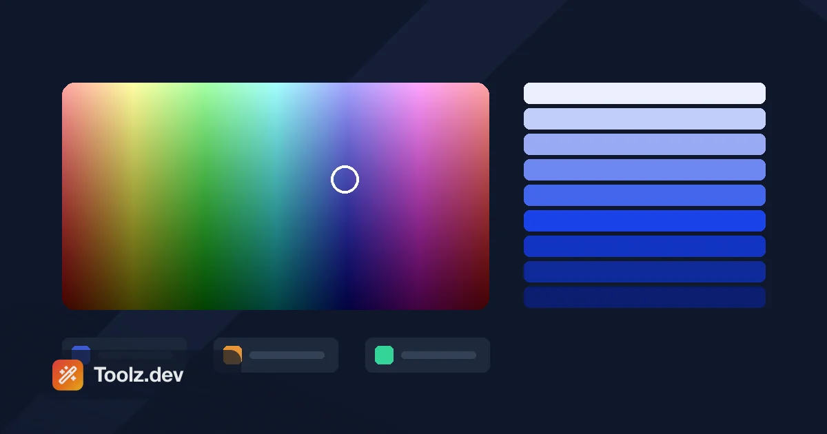
la selettore Su Toolz.dev converte tra esadecimale, RGB e HSL e mostra il rapporto di contrasto, nel browser, senza caricamento. Questa guida è ciò che vorrei leggere prima di spedire quei link.
tl; dr: maneggiare stregato Per valori statici, HSL Ogni volta che ne hai bisogno derivare un colore (stati al passaggio del mouse, tavolozze, modalità scure) perché la leggerezza è un numero da cui puoi sottrarre e RGBA/HSLA quando hai bisogno di alfa. Il contrasto è 4,5:1 per il corpo del testo e 3:1 per il testo di grandi dimensioni: controllalo, don' t eyeball it. selettore fa le conversioni e il rapporto. Quindi porta le tue fermate al Generatore di sfuma.
Hex, RGB, HSL: Qual è la differenza reale?
Descrivono tutti gli stessi colori sRGB. Ciò che differisce è a quali domande a cui ciascuno rende facile rispondere.
| stregato | RGB | HSL | Oklch | |
|---|---|---|---|---|
| assomigliare | #4466EE |
rgb(68 102 238) |
hsl(228 83% 60%) |
oklch(58% 0.21 265) |
| Forma alfa | #4466EEcc |
rgb(68 102 238 / 80%) |
hsl(228 83% 60% / 80%) |
oklch(58% 0.21 265 / 80%) |
| Risposte "Di che colore?" | No, devi decodificarlo | a mala pena | Sì, Hue è un numero | certo |
| Risposte "Rendilo 10% più scuro" | no | no | Sì, sottrarre da l | Sì, e percettivamente correttamente |
| percettivamente uniforme | no | no | no | certo |
| Usalo per | Valori statici, handoff di progettazione | Tela, WebGL, JS Maths | Stati al passaggio del mouse, tavolozze, temi | Tavolozze moderne, interpolazione sfumata |
| capisci | illeggibile per l'uomo | prolisso | 50% lightness ≠ uguale luminosità tra le tonalità |
Sintassi più recente; necessita di un fallback per i vecchi browser |
stregato
tre byte in esadecimale. #4466EE è rosso 44 (68), Verde 66 (102), Blu EE (238). stenografia #RGB funziona solo quando ogni coppia è raddoppiata - #FF0000 crolla a #F00, ma #4466EE non può essere abbreviato. Il modulo a 8 cifre aggiunge alfa: #4466EE80 è di circa il 50% opaco.
È l'impostazione predefinita in CSS perché è compatta e inequivocabile. È anche completamente opaco per la lettura umana, motivo per cui non ho mai guardato un codice esadecimale e ho saputo cosa cambiare per renderlo un po' meno saturo.
RGB
Stessi tre canali, decimale, 0–255. La moderna sintassi CSS Color 4 lascia cadere le virgole: rgb(68 102 238 / 80%). RGB è ciò che vuoi in JavaScript, Canvas e WebGL, perché è il formato che tutto ciò che consuma a valle effettivamente consuma e puoi fare aritmetica su di esso.
HSL - quella che si guadagna il suo posto
Tonalità (0–360° intorno alla ruota), saturazione (0–100%), leggerezza (0–100%). #4466EE è hsl(228, 83%, 60%).
Ecco perché è importante. Lo stato di passaggio di un pulsante dovrebbe essere "lo stesso colore, leggermente più scuro". In esadecimale è una domanda senza risposta. In HSL è sottrazione:
.btn {
  background: hsl(228 83% 60%);   /* #4466EE */
}
.btn:hover  { background: hsl(228 83% 52%); }  /* darker  */
.btn:active { background: hsl(228 83% 44%); }  /* darker still */
.btn:disabled { background: hsl(228 22% 70%); } /* desaturated, lifted */
Quattro stati, una tonalità, nessuno strumento di progettazione. Questo è il 90% del motivo per cui HSL è nel mio kit di strumenti.
Il problema - e it' è reale - è che la leggerezza HSL lo è no percettivo. hsl(60 100% 50%) (giallo) e hsl(240 100% 50%) (blu) Entrambi rivendicano il 50% di leggerezza e uno di loro brucerà le retine mentre l'altro è quasi nero. Questo è il problema che Oklch risolve.
Ok, brevemente
Livello colore CSS 4 porta oklch(L C H), dove è L percepito leggerezza. Due colori con la stessa L sembrano davvero ugualmente luminosi. È lo strumento giusto per generare una rampa tonale in cui ogni passaggio si sente equamente distanziato, ed è quello che uso oggi per un nuovo sistema di progettazione. È anche il motivo linear-gradient(in oklch, blue, yellow) does't diventa grigio al centro - vedi il Guida al generatore di gradiente CSS.
cmyk
Solo stampa. CSS non ha CMYK. Se una guida del marchio ti fornisce i valori CMYK, qualcuno deve convertirli in sRGB e la conversione è approssimativa perché le gamme differiscono veramente: ci sono ciani che una stampante può colpire e che il tuo monitor può #39; t e viceversa Ottieni ambo valori definiti nella guida del marchio piuttosto che convertire l'uno all'altro e sperare.
Come faccio a convertire tra loro?
Hex → RGB è solo una conversione di base. #4466EE → Diviso in 44, 66, EE → 68, 102, 238.
RGB → HSL implica la ricerca di canali max/min, derivando la leggerezza dalla loro media, quindi saturazione e tonalità da lì. Sono quindici righe di codice e ho scritto quelle quindici righe a memoria esattamente zero volte. Per un'unica, la selettore lo fa all'istante. per codice:
const hexToRgb = (hex) => {
  const n = parseInt(hex.replace('#', ''), 16);
  return { r: (n >> 16) & 255, g: (n >> 8) & 255, b: n & 255 };
};

const rgbToHex = (r, g, b) =>
  '#' + [r, g, b].map(v => v.toString(16).padStart(2, '0')).join('');
E quello che conta davvero: luminanza relativa e rapporto di contrasto, direttamente dal Definizione WCAG:
const luminance = (hex) => {
  const { r, g, b } = hexToRgb(hex);
  const [R, G, B] = [r, g, b]
    .map(v => v / 255)
    .map(v => (v <= 0.03928 ? v / 12.92 : ((v + 0.055) / 1.055) ** 2.4));
  return 0.2126 * R + 0.7152 * G + 0.0722 * B;
};

const contrast = (a, b) => {
  const [x, y] = [luminance(a), luminance(b)].sort((m, n) => n - m);
  return (x + 0.05) / (y + 0.05);
};

contrast('#E99537', '#FFFFFF'); // 2.38  ← the one that got me
contrast('#E99537', '#0F172A'); // 7.50
Nota quei coefficienti verdi: 0,2126 rosso, 0,7152 verde, 0,0722 blu. Il verde porta all'incirca settanta per cento di luminosità percepita. Ecco perché un verde brillante e un blu brillante con identica leggerezza HSL non assomigliano per niente, ed è l'intero motivo per cui esistono spazi di colore percettivi.
Quali rapporti di contrasto devo effettivamente colpire?
| a livello | testo normale | Testo di grandi dimensioni (18pt / 24px, o 14pt / 18.66px grassetto) | Componenti dell'interfaccia utente e grafica |
|---|---|---|---|
| AA | 4.5:1 | 3:1 | 3:1 (SC 1.4.11) |
| AAA | 7:1 | 4.5:1 | - |
Alcuni numeri reali, tutti calcolati piuttosto che indovinati:
| primo piano | fondo | rapporto | verdetto |
|---|---|---|---|
#000000 |
#FFFFFF |
21.00:1 | il soffitto |
#333333 |
#FFFFFF |
12.63:1 | AAA |
#595959 |
#FFFFFF |
7.00:1 | aaa, esatto |
#767676 |
#FFFFFF |
4.54:1 | AA - con 0,04 di anticipo |
#999999 |
#FFFFFF |
2.85:1 | Fallisce tutto |
#4466EE |
#FFFFFF |
4.79:1 | AA per il corpo del testo |
#4466EE |
#0F172A |
3.72:1 | Solo testo di grandi dimensioni |
#E99537 |
#FFFFFF |
2.38:1 | mancato- il mio errore |
#E99537 |
#0F172A |
7.50:1 | AAA |
Due cose cadono da quel tavolo.
#767676 è il grigio più chiaro che passa AA su bianco. no #888, no #999. Ogni colore "secondo" muto" che vedo in natura è una o due sfumature. Vale la pena memorizzare.
Lo stesso colore di marca può passare e fallire a seconda di dove lo metti. Il nostro arancione è inutilizzabile come anello su bianco ed eccellente come accento sulla marina. Non è un difetto nel colore, è un vincolo su dove si può vivere il colore. Una volta che l'ho inquadrato in questo modo, la decisione di progettazione è diventata più facile, non più difficile.
Come faccio a costruire una tavolozza che non combatta da sola?
Scegli una tonalità. variare la leggerezza. Questo è l'intero metodo e HSL lo rende meccanico:
:root {
  /* One hue: 228. Nine steps of lightness. */
  --blue-50:  hsl(228 83% 96%);
  --blue-100: hsl(228 83% 91%);
  --blue-200: hsl(228 83% 84%);
  --blue-300: hsl(228 83% 76%);
  --blue-400: hsl(228 83% 68%);
  --blue-500: hsl(228 83% 60%);  /* #4466EE — the brand colour */
  --blue-600: hsl(228 83% 50%);
  --blue-700: hsl(228 78% 41%);
  --blue-800: hsl(228 72% 33%);
  --blue-900: hsl(228 66% 25%);
}
La saturazione del preavviso diminuisce leggermente all'estremità scura Mantenendo costante la saturazione mentre la leggerezza diminuisce si producono passi che sembrano sempre più duri e al neon - una piccola desaturazione nella parte inferiore è ciò che fa sembrare una rampa progettata anziché generata.
Quindi nomina le cose per ruolo, non per aspetto, quindi un rebranding è una modifica di una riga invece di un trovare e sostituire in quaranta file:
:root {
  --color-primary: var(--blue-500);
  --color-primary-hover: var(--blue-600);
  --color-text: #0F172A;
  --color-text-muted: #6B7280;   /* 4.83:1 on white — checked */
  --color-surface: #F8FAFC;
  --color-border: #E5E7EB;
}

@media (prefers-color-scheme: dark) {
  :root {
    --color-primary: var(--blue-400);  /* lift it — dark bg needs a lighter primary */
    --color-text: #F8FAFC;
    --color-text-muted: #9CA3AF;
    --color-surface: #1E293B;
    --color-border: #374151;
  }
}
La modalità oscura non è un'inversione
Non capovolgere la tavolozza. Due cose si rompono immediatamente:
- I colori saturi diventano più forti su sfondi scuri. Un blu vivido che si legge come "professionale" su bianco si legge come "vibrante" su quasi nero. Solleva la leggerezza, lascia cadere un po' la saturazione.
- Gli sfondi neri puri causano l'halazione- testo luminoso acceso
#000Sbavature per le persone con astigmatismo. Usa un blu grigio molto scuro (#0F172A,#111827) invece. Ti dà anche un posto dove andare per superfici elevate, che il nero puro non fa.
schemi di armonia, onestamente
| sistema | cosa significa | Quando lo userei |
|---|---|---|
| monocromatico | Una tonalità, molte leggerezze | Quasi sempre. È la rampa sopra. |
| analogo | Tonalità adiacenti (blu + indaco + verde acqua) | sfondi e sfumature che devono sentirsi calmi |
| complementare | Tonalità opposte (blu + arancione) | Esattamente un accento. Il nostro è #4466EE / #E99537. |
| triadico | tre distanziati uniformemente | Viz, dove le categorie devono essere distinguibili |
| diviso-complementare | una tonalità + due accanto al suo opposto | Quando il complementare dritto si sente troppo aggressivo |
La regola su cui continuo a tornare: Una primaria, un accento, una rampa grigia. Tutto ciò che deve giustificare la sua esistenza.
Cos'altro fa inciampare le persone?
Il colore da solo non è mai abbastanza
Circa 1 uomo su 12 e 1 donna su 200 hanno una qualche forma di carenza di visione del colore. Se rosso significhi errore e verde-mezzo-successo è il tuo soltanto Segnale, una fetta significativa dei tuoi utenti vede due distintivi grigi identici. Aggiungi un'icona, aggiungi una parola. WCAG SC 1.4.1 è esplicito su questo e te ne costa uno <span>.
Il test di un secondo: screenshot della tua interfaccia utente, desatura e vedi se funziona ancora. Se non è così, il colore sta facendo un lavoro portante non dovrebbe fare da solo.
Anche gli anelli di messa a fuoco hanno bisogno di contrasto
Gli indicatori di messa a fuoco sono componenti dell'interfaccia utente e rientrano nella regola 3:1 contro adiacente colori - il che significa che un anello di messa a fuoco deve contrastare sia con l'elemento che circonda che con la pagina dietro di esso Un sottile contorno blu su un pulsante blu è un fallimento comune e completamente invisibile.
prima in grigio design
Costruisci l'intero layout in scala di grigi Costringe la gerarchia a provenire da dimensioni, peso e spaziatura - che è dove la gerarchia dovere vieni da. Aggiungi colore per ultimo, come enfasi. Le interfacce costruite in questo modo sono accessibili quasi per caso e sopravvivono alla modalità oscura senza una riscrittura.
Usando il selettore di colori
- Apri il selettore.
- Trascinare sullo spettro, o incollare un valore noto nel campo HEX, RGB o HSL - gli altri si aggiornano in fase.
- Nota l'HSL. Questo è il tuo formato di lavoro.
- Genera la rampa tenendo premuto H e S e facendo un passo L.
- Controlla ogni coppia di testo/sfondo rispetto alla riga 4.5:1 prima Va in un foglio di stile, non dopo che un cliente ti ha inviato un'e-mail a riguardo.
Tutto viene eseguito nella scheda Non viene caricato nulla: puoi confermarlo nel pannello Rete DevTools in circa dieci secondi.
Domande frequenti
Qual è la differenza tra esadecimale e RGB?
Niente, semanticamente - codificano gli stessi tre canali sRGB. HEX li scrive in base 16 (#4466EE), RGB in decimale (rgb(68 102 238)). Hex è più compatto ed è la convenzione CSS; RGB è più facile da calcolare in JavaScript. Scegli per contesto, non per principio.
Quale formato di colore dovrei usare in CSS?
Hex per valori statici che stai solo trascrivendo. HSL ogni volta che ne hai bisogno derivare un colore - stati di hover, stati disabilitati, una rampa tonale, una variante in modalità scura - perché la leggerezza è un numero che puoi regolare HSLA o RGBA quando hai bisogno di alfa. OKLCH se tu' stai costruendo un nuovo sistema di progettazione e desideri passi percettivamente uniformi.
Come faccio a sapere se i miei colori sono accessibili?
Calcola il rapporto di contrasto WCAG 2.1 AA ha bisogno di 4.5:1 per il testo normale, 3:1 per il testo di grandi dimensioni (18pt, o 14pt in grassetto) e per i componenti dell'interfaccia utente Non giudicare a occhio - #E99537 Su bianco sembra a posto e segna 2,38:1. Verificare inoltre che nessuna informazione sia trasmessa dal solo colore.
Qual è il grigio più chiaro che posso usare per il testo su bianco?
#767676, che atterra a 4,54:1 - appena oltre la linea AA 4,5:1. #999999 è solo 2,85:1 e fallisce. Se vuoi AAA, #595959 Colpisce esattamente 7.00:1.
Perché la luminosità HSL non corrisponde alla luminosità percepita?
Perché HSL è una semplice trasformazione matematica di RGB, non un modello di visione umana L'occhio è molto più sensibile al verde che al blu - la formula di luminanza WCAG pesa verde a 0,7152 e blu a 0,0722 - quindi hsl(60 100% 50%) (giallo) e hsl(240 100% 50%) (blu) non assomigliano per niente nonostante entrambi rivendichino il 50% di leggerezza. Oklch esiste specificamente per risolvere questo problema.
Come si costruisce una tavolozza in modalità oscura?
Non invertire quello leggero. Costruisci una seconda tavolozza: uno sfondo grigio-blu scuro piuttosto che nero puro (il nero puro provoca l'alatazione per i lettori con astigmatismo), versioni più chiare e leggermente meno sature dei tuoi accenti e testo che è bianco sporco piuttosto che #FFFFFF. Scambiali con proprietà personalizzate CSS in prefers-color-scheme: dark.
Qual è il colore migliore per un pulsante di invito all'azione?
C'è't uno. Le prove per & quot; l'arancione converte best" è sottile e per lo più folklore Ciò che conta è che il CTA contrasti con tutto ciò che lo circonda e che lo stesso colore significhi la stessa cosa ovunque sul sito. Se la tua pagina è prevalentemente blu, funziona un CTA arancione, a causa del contrasto, non dell'arancione.
Posso usare i colori CMYK sul web?
No - CSS non ha notazione CMYK, e le gamme don' t mappano in modo pulito, quindi qualsiasi conversione è un'approssimazione Se hai bisogno di coerenza del marchio su stampa e schermo, definisci entrambi i valori nella guida del marchio dall'inizio piuttosto che convertirne uno nell'altro.
Come faccio a convertire un colore esadecimale in RGB?
Dividi l'esagono a sei cifre in tre coppie e leggi ogni coppia come numero base 16 da 0 a 255. #4466EE diventa rgb(68, 102, 238): 44 fa 68, 66 è 102 e EE è 238. una stenografia a tre cifre come #46E Si espande prima raddoppiando ogni cifra. Il selettore di colori esegue questa conversione istantaneamente, in entrambe le direzioni.
Che cos'è un codice colore esadecimale?
Un codice colore esadecimale è una rappresentazione a sei cifre di base 16 di un colore sRGB, utilizzando due cifre ciascuna per i canali rosso, verde e blu dopo una guida #. #FFFFFF è bianco e #000000 è nero. una settima e ottava cifra opzionale aggiungi un canale alfa (opacità), come in #4466EE80.
incasso
Il lavoro a colori ha due metà e la maggior parte di noi fa solo la prima. Scegliere una tavolozza è la metà divertente e soggettiva. Verificarlo - luminanza, contrasto, leggibilità daltonica, comportamento in modalità oscura - è la metà di ciò' è solo aritmetica, e it' è la metà che decide se le persone possono effettivamente leggere ciò che hai costruito.
L'aritmetica non è difficile. è solo qualcosa che devi truffa, e non ho, per mesi, sul mio sito, in un colore che ho scelto io stesso.
la selettore Converte tra hex, rgb e hsl e ti dà il rapporto di contrasto, gratuito e interamente nel tuo browser. Abbinalo al Generatore di sfuma Per le miscele che mantengono il loro contrasto da un capo all'altro e vedere il resto dello scaffale nel Guida agli strumenti di produttività per gli sviluppatori.