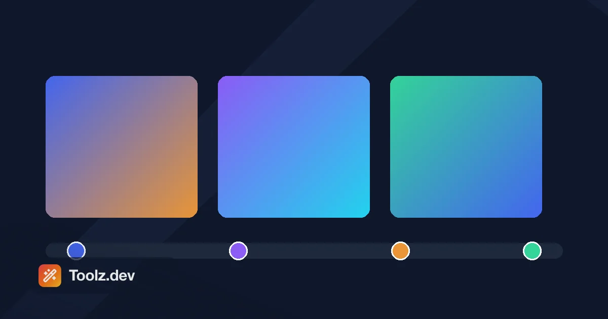
Ho perso la maggior parte di un pomeriggio a causa di un gradiente una volta Non complicato - uno sfondo eroe su una pagina di marketing di WP Adminify, blu di marca che sfuma in arancione di marca, diagonale Ho scritto linear-gradient(45deg, #4466EE, #E99537) Ed è andata nel modo sbagliato. Quindi ho provato -45deg. anche sbagliato. poi 135deg, che era giusto, e sono andato avanti senza capire perché, che è il peggior risultato possibile perché garantisce che sbaglierai di nuovo.
Il motivo è che gli angoli del gradiente CSS non sono gli angoli che hai imparato durante la lezione di matematica. 0deg puntine sopra, e l'angolo aumenta in senso orario. In trigonometria - e in SVG, e in tela - 0 punti retti e gli angoli aumentano in senso antiorario Due convenzioni diverse, una dall'aspetto identico deg unità e nessun messaggio di errore quando si seleziona quello sbagliato. È scritto chiaramente in Immagini CSS Livello modulo 3, e semplicemente non l'avevo mai letto.
Questo è il caso di un generatore visivo in un aneddoto. la Generatore di sfuma su Toolz.dev ti offre un'anteprima dal vivo, stop di colore draggabili e CSS copiabili per gradienti lineari, radiali e conici, quindi la domanda sull'angolo risponde da sola invece di costarti un pomeriggio.
tl; dr: In CSS,
0degindica il tappo e gli angoli corrono in senso orario, cosìto rightpari90dege una diagonale in alto a sinistra → in basso a destra è135deg, no45deg. maneggiare Generatore di sfuma vederlo piuttosto che indovinarlo, e il selettore Per scegliere le fermate che non si affaticano nel mezzo. I gradienti sono<image>valori - ovunque tu possa usareurl(), puoi usare un gradiente. Tutto lato client, nessuna registrazione.
Che cos'è un gradiente CSS, tecnicamente?
Un gradiente non è un colore. è un immagine. Questo singolo fatto spiega la maggior parte della sintassi.
a Immagini CSS Livello 3, linear-gradient(), radial-gradient()e le loro varianti ripetute producono un valore di tipo <image>. Ciò significa che ovunque le specifiche accettino url('photo.jpg'), accetta anche un gradiente: background-image, border-image, list-style-image, mask-image, content. significa anche che hanno i gradienti Nessuna dimensione intrinseca- si allungano per riempire la scatola in cui li metti, motivo per cui lo stesso gradiente sembra diverso su un pulsante 200px e un eroe 1400px.
conic-gradient() è venuto più tardi e ci vive Immagini CSS Livello 4, insieme alla sintassi interpolazione-colore-spazio arriverò a di seguito.
Qual è la differenza tra lineare, radiale e conico?
| lineare | radiale | conico | |
|---|---|---|---|
| Il colore viaggia | Lungo una linea retta | verso l'esterno da un punto centrale | intorno a un punto centrale |
| definito da | Un angolo o to <side> |
forma (circle/ellipse), dimensione, posizione |
Angolo di inizio, posizione |
| raggiungerlo quando | Sfondi, pulsanti, sovrapposizioni, scrim per immagini | Faretti, bagliori, vignette, sfondi in mesh | Grafici a torta, ruote colorate, anelli di progresso, settori a taglio duro |
| scherzo | immagini 3 | immagini 3 | Immagini 4 |
| Il trucco hard-stop ti dà | strisce | anelli | spicchi / fette di torta |
| capisci | La convenzione dell'angolo | Le parole chiave di dimensioni cambiano tutto | Gli angoli qui sono anche in senso orario dalle ore 12 |
Gradienti lineari - e la convenzione dell'angolo
/* Default: top to bottom. No angle needed. */
background: linear-gradient(#4466EE, #E99537);

/* Keywords are the safe way to say it */
background: linear-gradient(to right, #4466EE, #E99537);
background: linear-gradient(to bottom right, #4466EE, #E99537);

/* Angles: 0deg = up, clockwise from there */
background: linear-gradient(90deg, #4466EE, #E99537);   /* same as `to right` */
background: linear-gradient(180deg, #4466EE, #E99537);  /* same as `to bottom` */
background: linear-gradient(135deg, #4466EE, #E99537);  /* top-left → bottom-right */
Impegnalo a memoria e non ripeterai mai il mio pomeriggio:
| parola chiave | angolo |
|---|---|
to top |
0deg |
to right |
90deg |
to bottom |
180deg (il valore predefinito) |
to left |
270deg |
C'è un'altra sottigliezza con le parole chiave d'angolo. to bottom right operazione no semplicemente significa 135deg. La specifica lo definisce come un angolo scelto in modo che la linea di sfumatura sia perpendicolare al altro diagonale - che significa su una scatola non quadrata, to bottom right e 135deg produrre risultati visibilmente diversi. Su un quadrato sono identici. Questo è il genere di cose che noti alle 23:00 quando una carta sembra giusta nel design e sbagliata in una colonna stretta.
Gradienti radiali - dove vivono le parole chiave di dimensione
/* Simple */
background: radial-gradient(circle, #4466EE, #0F172A);

/* Positioned spotlight */
background: radial-gradient(circle at 30% 20%, #4466EE, transparent 60%);

/* Explicit size */
background: radial-gradient(circle closest-side at 60% 40%, #E99537, transparent);
Le quattro parole chiave di dimensione decidono dove ultimo Colori Stop Lands, misurata dal centro:
closest-side- il bordo più vicino della scatolafarthest-side- il bordo più lontanoclosest-corner- l'angolo più vicinofarthest-corner- l'angolo più lontano (questo è l'impostazione predefinita)
Cambia la parola chiave e il gradiente sembra un gradiente diverso. Questo è il motivo più comune per cui un gradiente radiale non ha fatto quello che voglio, ed è molto più veloce fare clic sulle quattro opzioni nel Generatore di sfuma che ragionare a riguardo.
Gradienti conici: torte, ruote e anelli
Colore spazza conico intorno a il centro, a partire dalle 12 e n. 39; orologio e in senso orario (stessa convenzione di lineare - almeno it's coerente).
/* Colour wheel */
background: conic-gradient(red, yellow, lime, aqua, blue, magenta, red);

/* Pie chart with hard stops — 40% / 35% / 25% */
background: conic-gradient(
  #4466EE 0deg 144deg,
  #E99537 144deg 270deg,
  #34D399 270deg 360deg
);

/* Progress ring: conic + a mask */
.ring {
  background: conic-gradient(#4466EE 0turn 0.63turn, #E5E7EB 0.63turn 1turn);
  mask: radial-gradient(circle, transparent 60%, #000 61%);
  border-radius: 50%;
}
la quale mask Line è l'intero trucco dietro ogni indicatore di avanzamento della ciambella che tu abbia mai visto, ed è circa sei righe di CSS invece di una libreria SVG.
Come posso controllare dove atterrano i colori?
Il colore si ferma
Ferma una posizione e controlli la transizione. fermare due posizioni e ottieni un vantaggio: nessuna interpolazione.
/* Even (default) */
background: linear-gradient(to right, #4466EE, #E99537);

/* Explicit positions: solid blue to 30%, then blend */
background: linear-gradient(to right, #4466EE 30%, #E99537 70%);

/* Hard stops = stripes. The double-position syntax is Images 4. */
background: linear-gradient(
  to right,
  #4466EE 0 25%,
  #E99537 25% 50%,
  #34D399 50% 75%,
  #0F172A 75% 100%
);
Suggerimenti per l'interpolazione (il punto medio che non sapevi di poter muovere)
Una percentuale nuda fra Due colori sposta il punto medio 50/50. Questa è la sintassi del gradiente più sottoutilizzata che conosco:
/* Default: the halfway colour sits at 50% */
background: linear-gradient(to right, #4466EE, #E99537);

/* Halfway colour now sits at 25% — blue gives way early */
background: linear-gradient(to right, #4466EE, 25%, #E99537);
Usalo per le scrim delle immagini. un' to top, rgba(0,0,0,.8), transparent sovrapposizione di solito mangia troppo della foto; lascia a 35% Suggerimento e l'oscurità crolla verso il basso dove si trova la didascalia.
Gradienti ripetuti per i modelli
.hatched {
  background: repeating-linear-gradient(
    45deg,
    #0F172A 0 10px,
    #1E293B 10px 20px
  );
}
Una riga, nessun file immagine, scalabile all'infinito Basta don' t applicarlo a un elemento a pagina intera e poi chiedersi perché lo scorrimento balbetta su un Android di fascia media - ridipingere un ampio gradiente ripetuto durante lo scorrimento è un vero lavoro per il compositore.
Perché il mio gradiente sembra fangoso nel mezzo?
Due cause separate e le persone le confondono costantemente.
Causa 1: interpolazione sRGB
Per impostazione predefinita, i browser mescolano gli arresti del gradiente in sRGB, canale per canale. Per due colori che si trovano uno vicino all'altro sulla ruota - dal blu al viola, dall'arancione al rosso - va bene. Per i colori complementari produce una banda grigia morta al centro, perché il punto medio matematico di due colori sRGB opposti è grosso modo grigio. Il blu al giallo è il classico delinquente.
CSS Images Level 4 risolve questo problema consentendo di nominare lo spazio di interpolazione:
/* Grey sludge in the middle */
background: linear-gradient(to right, blue, yellow);

/* Vivid all the way through */
background: linear-gradient(in oklch, to right, blue, yellow);
oklch Mantiene la leggerezza percepita e il cromo costante attraverso la miscela. Supporto del browser per il in <colorspace> La sintassi è buona in Chrome, Safari e Firefox attuali, ma se hai bisogno di supportare i browser meno recenti, il fallback è la vecchia correzione manuale: aggiungi un arresto intermedio e guida tu stesso la miscela.
Causa 2: dissolvenza transparent- e il mio secondo errore
transparent è definito come rgba(0, 0, 0, 0). trasparente nero. Se i browser si interpolavano ingenuamente, linear-gradient(#E99537, transparent) Scivolerebbe attraverso l'arancione progressivamente più scuro e più grigio che si recava al nulla.
I browser moderni don't fare che - le specifiche richiedono l'interpolazione in premoltiplicato Spazio alfa, che aggira completamente il problema. Ma il vecchio Webkit non l'ha fatto, e ho spedito un eroe su un sito client che sembrava pulito sulla mia macchina e sembrava una macchia sporca sul loro iPad di due anni. La versione Bulletproof, che non ti costa nulla e funziona ancora ovunque:
/* Explicit: same colour, zero alpha */
background: linear-gradient(#E99537, rgba(233, 149, 55, 0));
Lo scrivo ancora in questo modo dal tessuto cicatriziale.
A cosa devo prestare attenzione con l'accessibilità?
Il contrasto deve reggere sull'intero gradiente
WCAG 2.1 SC 1.4.3 Richiede 4,5:1 per il testo normale e 3:1 per il testo di grandi dimensioni (18pt o 14pt grassetto). Un gradiente significa che il colore di sfondo è diverso ad ogni pixel, quindi il requisito deve essere soddisfatto peggiore punto: la patch più chiara se il testo è bianco, la più scura se è & #39; è nero.
Il modello affidabile è smettere di cercare di rendere leggibile il gradiente stesso e sovrapporre una tela in alto:
.hero {
  background:
    linear-gradient(to bottom, rgba(15, 23, 42, 0.55), rgba(15, 23, 42, 0.8)),
    linear-gradient(135deg, #4466EE, #E99537);
  color: #fff;
}
Ora il testo si trova su un intervallo scuro noto indipendentemente da cosa sta facendo il gradiente sottostante. Controllare le estremità con il selettore prima della spedizione, la procedura dettagliata a contrasto completo, incluso il colore del marchio che ho spedito a 2,38:1, è presente nel file Guida al selettore di colori.
Il testo sfumato è una botola
Questo è quello che mi ha effettivamente bruciato su una landing page di produzione:
.gradient-heading {
  background: linear-gradient(135deg, #4466EE, #E99537);
  background-clip: text;
  -webkit-background-clip: text;
  color: transparent;
}
qualora background-clip: text does't si applica per qualsiasi motivo - un vecchio browser, un'estensione che blocca le immagini di sfondo, un foglio di stile di stampa - you're sinistra con color: transparent e un Intestazione invisibile. Il testo è ancora nel DOM, quindi uno screen reader lo legge felicemente e non hai idea che qualcosa non va. maneggiare @supports per cavarlo:
.gradient-heading { color: #0F172A; }

@supports (background-clip: text) or (-webkit-background-clip: text) {
  .gradient-heading {
    background: linear-gradient(135deg, #4466EE, #E99537);
    background-clip: text;
    -webkit-background-clip: text;
    color: transparent;
  }
}
Colore solido Per impostazione predefinita, sfumatura come miglioramento. Ecco come avrebbe dovuto essere scritto la prima volta.
I gradienti animati hanno bisogno di un portello di fuga in movimento
non puoi passare il gradiente di transizione colori- il browser ha vinto't interpolare tra due <image> valori. Ciò che le persone animano invece è background-position Attraverso un gradiente sovradimensionato:
.animated {
  background: linear-gradient(270deg, #4466EE, #E99537, #34D399);
  background-size: 600% 600%;
  animation: shift 12s ease infinite;
}

@keyframes shift {
  0%, 100% { background-position: 0% 50%; }
  50%      { background-position: 100% 50%; }
}

@media (prefers-reduced-motion: reduce) {
  .animated { animation: none; }
}
Quell'ultimo blocco non è facoltativo. Il movimento di fondo continuo è un fattore scatenante documentato per i disturbi vestibolari e l'onore prefers-reduced-motion sono tre righe.
(L'alternativa moderna è registrare una proprietà personalizzata con @property Quindi il suo tipo è noto e perciò animabile, quindi usandolo all'interno del gradiente. È pulito, è supportato nei browser attuali e vale ancora la pena avere la protezione a movimento ridotto.)
Come faccio a costruirne uno con lo strumento?
- Apri il Generatore di sfuma.
- Scegli un tipo: lineare, radiale o conico.
- Fare clic su una fermata per cambiare colore; trascinarlo per spostare la sua posizione. Fai clic sulla barra per aggiungere una fermata; trascinala per rimuoverla.
- Per lineare, trascina l'angolo. Guarda il numero: qui è dove il
0deg-IS-UP Convention smette di essere astratto. - Per radiale, ciclo le quattro parole chiave e guarda cosa cambia. È il modo più veloce per costruire l'intuizione per loro.
- Copia il CSS.
Due colori sono solitamente la risposta giusta. Ogni gradiente di cui mi sono pentito ha avuto cinque fermate.
Gradienti che vale la pena rubare
/* Toolz brand diagonal */
background: linear-gradient(135deg, #4466EE, #E99537);

/* Deep UI surface — subtle enough that nobody calls it a gradient */
background: linear-gradient(to bottom, #1E293B, #0F172A);

/* Card lift: 4% of tonal difference, and it reads as depth */
background: linear-gradient(to bottom, #FFFFFF, #F8FAFC);

/* Mesh — four positioned radials over a base colour */
background-color: #4466EE;
background-image:
  radial-gradient(at 18% 24%, #E99537 0px, transparent 52%),
  radial-gradient(at 79% 17%, #34D399 0px, transparent 48%),
  radial-gradient(at 41% 83%, #8B5CF6 0px, transparent 55%);

/* Frosted glass */
background: linear-gradient(135deg, rgba(255,255,255,0.12), rgba(255,255,255,0.04));
backdrop-filter: blur(12px);
border: 1px solid rgba(255,255,255,0.18);
Dai ai colori del tuo marchio il selettore innanzitutto, prendi i valori HSL, quindi varia la leggerezza anziché la tonalità: ecco come ottieni le fermate che si fondono in modo pulito invece di combattere.
Domande frequenti
Perché il mio gradiente CSS sta andando nella direzione sbagliata?
Poiché gli angoli di gradiente CSS iniziano dal tappo e aumentare in senso orario, a differenza della trigonometria, SVG o Canvas, che iniziano a destra e vanno in senso antiorario. to right è 90deg, to bottom è 180deg, e una diagonale in alto a sinistra in basso a destra è 135deg, no 45deg.
Ho ancora bisogno -webkit- Prefissi per gradienti CSS?
non per linear-gradient(), radial-gradient(), o conic-gradient()- tutti e tre funzionano senza prefisso in ogni browser corrente L'unico posto in cui il prefisso guadagna ancora il suo mantenimento è -webkit-background-clip: text Per il testo sfumato, dove il vecchio Safari ne ha bisogno. spedire entrambe le dichiarazioni lì.
Posso animare un gradiente CSS?
Non il valore del gradiente stesso: un gradiente è un <image>, e il browser non interpola tra due immagini. La soluzione standard è rendere il gradiente molto più grande della sua scatola (background-size: 600% 600%) e animare background-position. L'approccio moderno registra una proprietà personalizzata con @property Quindi ha un tipo noto e diventa animabile all'interno del gradiente. In ogni caso, proteggilo con prefers-reduced-motion.
Perché il mio gradiente sembra grigio o fangoso nel mezzo?
Quasi sempre l'interpolazione sRGB tra i colori che si trovano uno di fronte all'altro sulla ruota: il classico è il blu e il giallo. Il loro punto medio sRGB è veramente vicino al grigio. Risolvilo nominando uno spazio di interpolazione migliore linear-gradient(in oklch, to right, blue, yellow), o aggiungendo una fermata intermedia per guidare la miscela da soli.
Perché svanire transparent Sembri sporco?
transparent è definito come rgba(0, 0, 0, 0)- trasparente nero. Gli attuali browser si interpolano nello spazio alfa premoltiplicato, quindi questo non è più un problema, ma il vecchio WebKit ha trascinato il gradiente attraverso il grigio mentre esce. Se sostieni i vecchi dispositivi, scrivi esplicitamente la versione zero-alpha del tuo colore: rgba(233, 149, 55, 0) invece di transparent.
Come faccio a creare un bordo sfumato?
Due opzioni. border-image: linear-gradient(135deg, #4466EE, #E99537) 1; è una riga ma uccide silenziosamente border-radius. Se hai bisogno di angoli arrotondati, sovrapponi due sfondi con diversi background-clip e background-origin valori o metti il gradiente su uno pseudoelemento dietro la casella.
I gradienti CSS sono dannosi per le prestazioni?
Un gradiente statico è economico - più economico rispetto al download di un'immagine equivalente, e scala a qualsiasi dimensione gratuitamente I costi si manifestano quando deve essere presente un gradiente di grandi dimensioni riverniciato Ripetutamente: un gradiente di ripetizione a pagina intera durante la pergamena o più sfumature a strati sotto a backdrop-filter. Se una pagina si sente appiccicosa sul cellulare, questa è la prima cosa che ho controllato in DevTools' Paint Profiler.
Quante fermate di colore dovrebbe avere un gradiente?
Due, la maggior parte delle volte. tre quando vuoi guidare la miscela attraverso una tonalità specifica. Oltre a ciò, di solito stai cercando qualcosa che un gradiente di mesh (diversi radiali posizionati) fa meglio, e ogni arresto in più è un'altra cosa che può sembrare sbagliata sul display di qualcun altro.
Come faccio a creare uno sfondo sfumato in CSS?
Imposta il background (o background-image) proprietà a una funzione sfumatura. background: linear-gradient(to right, #4466EE, #E99537); Dipinge una miscela da sinistra a destra senza alcun file immagine. radial-gradient() e conic-gradient() Segui lo stesso schema per le miscele circolari e travolte. Poiché il risultato viene generato anziché scaricato, rimane nitido a qualsiasi dimensione.
Come creo il testo sfumato in CSS?
Metti il gradiente background, quindi impostare background-clip: text (con il -webkit- prefisso per safari) e color: transparent, in modo che le lettere siano riempite dal gradiente anziché da un colore solido. Mantieni il testo reale nel markup anziché cuocerlo in un'immagine, in modo che rimanga selezionabile e leggibile dai lettori di schermo.
incasso
I gradienti sono una delle poche funzionalità CSS che ti offrono una reale ricchezza visiva a costo di rete pari a zero: nessuna richiesta di immagine, nessun problema di rapporto d'aspetto, indipendente dalla risoluzione per costruzione La sintassi è piccola Le trappole sono specifiche e conoscibili: la convenzione dell'angolo, le parole chiave di dimensione radiale, la confusione sRGB e la botola con intestazione invisibile nel testo sfumato.
Costruiscili dove puoi vederli. la Generatore di sfuma è gratuito, viene eseguito interamente nel tuo browser e copia CSS pulito. Abbinalo al selettore per le fermate che mantengono il loro contrasto, e il Minifier CSS Quando sei pronto per allinearlo. Il resto del ripiano frontale è nel Guida agli strumenti di produttività per gli sviluppatori.