What is the Color Contrast Checker?
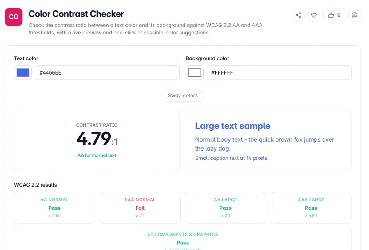
The Color Contrast Checker measures the contrast ratio between a foreground (text) color and a background color and tells you whether that pair meets the Web Content Accessibility Guidelines. It reports a single number between 1:1 and 21:1 and grades it against the WCAG 2.2 thresholds for AA and AAA at both normal and large text sizes, plus the separate 3:1 threshold for user-interface components and graphics.
Contrast is the difference in relative luminance between two colors, not just how different they look. Two colors can feel distinct while still failing for readers with low vision, color vision deficiency, or anyone using a phone in bright sunlight. The ratio is calculated with the exact sRGB relative-luminance formula defined by WCAG, so the result matches what auditing tools and screen-reader users experience rather than a rough visual guess.
Everything runs in your browser. Type or paste colors as HEX, RGB, HSL, or a CSS keyword, watch a live text preview update, and if a pair fails you can apply a suggested color that passes. Nothing is uploaded, there is no signup, and the tool keeps working offline once the page has loaded.
The WCAG 2 contrast formula is a ratio of relative luminance, and its thresholds are what accessibility audits and most legal requirements are measured against, so it is the right number to design to. It is also known to be imperfect: it can be generous to light text on dark backgrounds and harsh on some mid-tone pairs, which is why the successor algorithm, APCA, exists and is being trialled for future versions. Large text has a lower bar, and large means 18pt, or 14pt when bold, which is around 24px and 18.66px. Non-text elements are covered separately by 1.4.11 at 3:1, and that is the rule most often missed: icon buttons, input borders and focus rings all need it, and a design can pass on every paragraph and still fail on its form fields.
How to use the Color Contrast Checker?
Enter your text color
Type or paste the foreground color in any common format - #1a1a1a, rgb(26,26,26), hsl(0,0%,10%), or a keyword like navy. A color swatch and native picker let you fine-tune it.
Enter your background color
Set the background the text sits on. If your text color has transparency, it is blended over this background before the ratio is measured, matching what users actually see.
Read the ratio and grades
The exact contrast ratio appears with pass or fail badges for AA and AAA at normal and large sizes, plus the 3:1 UI-component check, all next to a live sample of text on your background.
Fix failures instantly
If a combination fails, apply the suggested accessible color - the tool nudges the text lighter or darker until it clears your target level, then you can copy the fixed value.
Key Features
Exact WCAG Ratio
Uses the official sRGB relative-luminance and contrast-ratio formulas from WCAG 2.2, so the number matches formal audits down to two decimal places rather than approximating
AA, AAA and UI Grading
Every result is graded against AA (4.5:1), AAA (7:1), the large-text thresholds (3:1 and 4.5:1), and the 3:1 rule for non-text UI components and graphical objects
Live Text Preview
A real sample of normal and large text renders on your chosen background as you type, so you can judge readability alongside the numeric score
Accessible Color Suggestions
When a pair fails, the tool walks the text color lighter or darker in HSL until it meets your target ratio and offers a passing value you can apply in one click
Frequently Asked Questions
Related Tools
Color Converter
Convert color codes between HEX, RGB, HSL, HWB, and CMYK instantly
Color Palette Generator
Generate harmonious color palettes from any base color - shades and tints, complementary, analogous, triadic, and monochromatic - with HEX codes you can copy and a CSS variables export.
Color Picker & Converter
Pick colors and convert between HEX, RGB, and HSL formats
Color Shades Generator
Generate tints, shades, and tones from any base color
Comments
0 comments
No comments yet. Be the first to share your thoughts!