text-shadow: 0px 0px 7px #4466eeff, 0px 0px 14px #4466eee6, 0px 0px 28px #4466eeb3;What is the CSS Text Shadow Generator?
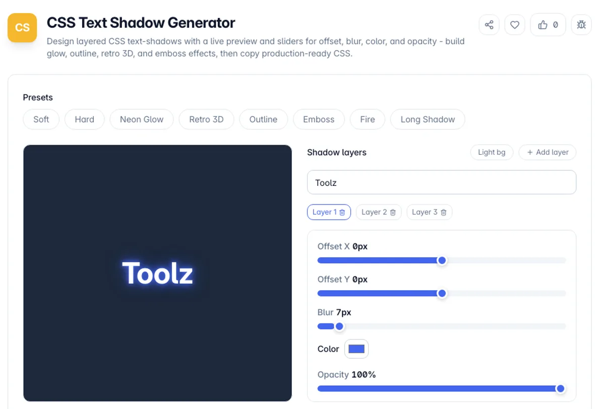
The CSS Text Shadow Generator is a visual editor for the CSS text-shadow property. You adjust the horizontal offset, vertical offset, blur radius, color, and opacity with sliders and watch the effect render live on sample text, then copy the exact CSS. Instead of guessing pixel values and refreshing your page, you shape the shadow directly and read the code it produces.
Whether you search for a CSS text-shadow generator, a text shadow generator CSS tool or a CSS shadow text generator, the output is the same single declaration. Click the Hard preset and the Generated CSS box shows text-shadow: 2px 2px 0px #00000099; which is one black layer at 60% opacity, with the opacity written into the last two hex digits. Click Neon Glow and you get three comma-separated layers at 7px, 14px and 28px blur. Copy CSS copies the whole line, semicolon included.
The text-shadow property is simpler than box-shadow - it has no spread radius and no inset keyword - but layering is where it gets powerful. A single declaration can stack several shadows, each with its own offsets, blur, and color. Stacking layers is how you build neon glows, hard outlines, retro 3D lettering, letterpress emboss effects, and long flat shadows. Writing those by hand is fiddly, so this tool manages the layers and outputs a spec-valid, comma-separated declaration in the correct paint order.
Everything happens in your browser. Pick a preset like Neon Glow or Outline, tune each layer, switch the preview between light and dark backgrounds, edit the sample text, and copy the CSS. No account, no uploads, and it keeps working offline once the page has loaded.
Layer order runs first to last, front to back, so the shadow listed first sits on top. That is what makes outlines work: four small shadows offset one pixel in each direction, stacked, approximate a stroke that CSS has no direct property for. Blur radius is the expensive part to render, and text with several large blurs repainted on scroll is a common cause of jank on lower-powered devices. Shadows never affect layout, so they can overflow their box and be clipped by a parent with overflow hidden.
How to use the CSS Text Shadow Generator?
Start from a preset
The page opens on the Neon Glow preset. Pick another preset like Soft, Retro 3D, or Outline for a realistic starting point, or delete layers down to one and build up from there.
Tune the shadow with sliders
Drag the horizontal and vertical offset and blur radius sliders, then set the shadow color and opacity. Watch the sample text update instantly as you edit.
Stack more layers for effects
Add extra layers to create glow, outline, or 3D depth - several offset copies of a shadow read as extruded text, while stacked blurred copies read as a glow.
Copy the CSS
Copy the text-shadow declaration and paste it straight into your stylesheet or component styles. Apply it to any text element to get the same effect.
Key Features
Multi-Layer Shadows
Stack any number of shadow layers into one declaration, in the correct top-to-bottom paint order, which is how neon glows, outlines, and 3D text are built
Full Property Control
Sliders for horizontal and vertical offset and blur radius, plus a color picker and an opacity control, cover every part of the text-shadow grammar
Live Preview
Sample text updates instantly as you edit, and you can switch its background between light and dark to check how the effect reads in both themes
Ready-Made Presets
Curated recipes for soft, hard, neon glow, retro 3D, outline, emboss, fire, and long-shadow effects give you a proven starting point instead of a blank canvas
Frequently Asked Questions
Related Tools
CSS Filter Generator
Apply blur, brightness, contrast, grayscale, sepia, hue-rotate and more with live sliders and a preview, then copy production-ready CSS filter code.
CSS Glassmorphism Generator
Create frosted-glass UI with a live preview and sliders for backdrop blur, transparency, saturation, color, and radius - then copy production-ready CSS.
CSS Neumorphism Generator
Create soft-UI (neumorphic) elements with a live preview and controls for distance, blur, intensity, radius, surface color, and flat/concave/convex/pressed shapes - then copy the CSS.
Maps Scraper
Pull business listings for any search and place: name, address, category, rating, review count, phone and website, deduplicated and exportable as CSV.
Comments
0 comments
No comments yet. Be the first to share your thoughts!