| px | rem | em | pt | % |
|---|---|---|---|---|
| 1 | 0.0625 | 0.0625 | 0.75 | 6.25 |
| 2 | 0.125 | 0.125 | 1.5 | 12.5 |
| 4 | 0.25 | 0.25 | 3 | 25 |
| 8 | 0.5 | 0.5 | 6 | 50 |
| 10 | 0.625 | 0.625 | 7.5 | 62.5 |
| 12 | 0.75 | 0.75 | 9 | 75 |
| 14 | 0.875 | 0.875 | 10.5 | 87.5 |
| 16 | 1 | 1 | 12 | 100 |
| 18 | 1.125 | 1.125 | 13.5 | 112.5 |
| 20 | 1.25 | 1.25 | 15 | 125 |
| 24 | 1.5 | 1.5 | 18 | 150 |
| 28 | 1.75 | 1.75 | 21 | 175 |
| 32 | 2 | 2 | 24 | 200 |
| 36 | 2.25 | 2.25 | 27 | 225 |
| 40 | 2.5 | 2.5 | 30 | 250 |
| 48 | 3 | 3 | 36 | 300 |
| 56 | 3.5 | 3.5 | 42 | 350 |
| 64 | 4 | 4 | 48 | 400 |
What is a CSS Unit Converter?
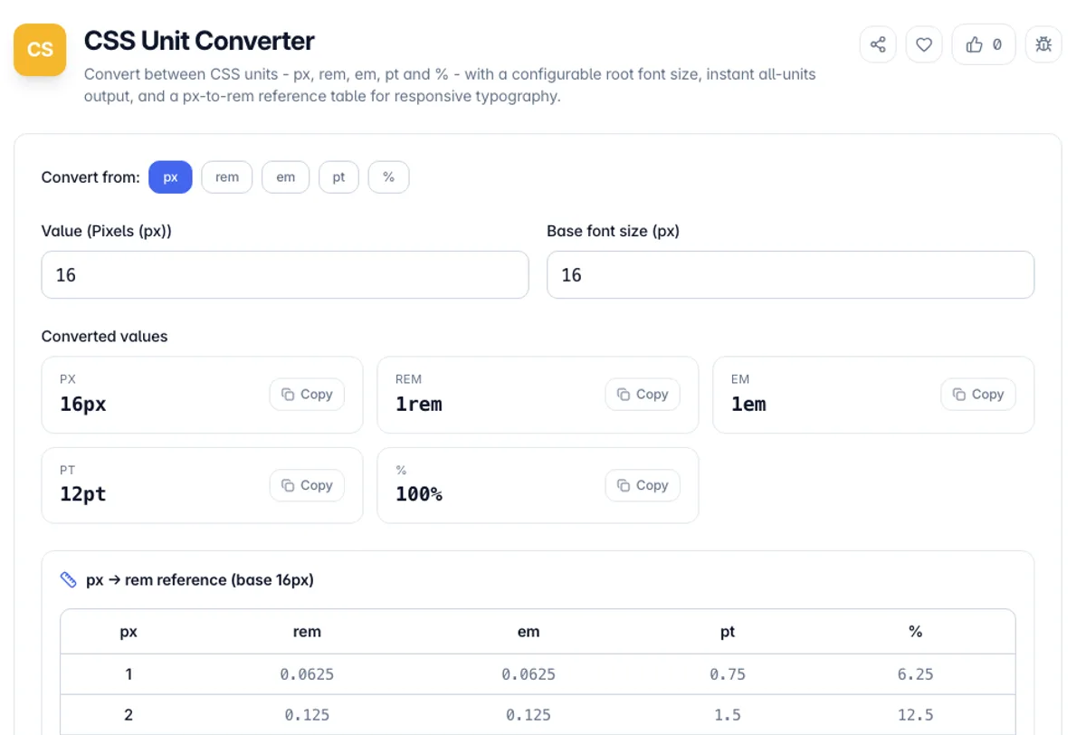
A CSS Unit Converter translates a length between the units CSS uses for sizing type and layout: px, rem, em, pt, and %. It exists because modern responsive design leans on relative units - rem and em scale with the user’s font-size settings and zoom - while design mockups and older stylesheets are usually expressed in fixed pixels. This tool takes a value like 24px and shows it as 1.5rem, 1.5em, 18pt, and 150% at once, and works in every direction from a single field.
The conversions all hinge on one number: the root (base) font size, which defaults to 16px because that is the browser default for the html element. One rem always equals that base font size, so at 16px the value 16px is 1rem, 24px is 1.5rem, and 8px is 0.5rem. Points are tied to the CSS reference pixel - 1 inch is 96px and 72pt - so 1pt equals 96/72, about 1.333px. Percent is treated as a share of the base font size, so 100% equals the base and 50% equals half of it.
Everything runs in your browser as you type, so there is no upload and no waiting on a server. Change the base font size to model a component that sets its own font-size, read the results in every unit, and copy the one you need. The built-in px-to-rem table gives you a ready reference for the sizes that come up most in a type scale.
How to use the CSS Unit Converter?
Enter a value and pick its unit
Type the number you want to convert and choose the unit it is currently in - px, rem, em, pt, or %. You can also paste a value with its unit, like 24px, and the tool will read the unit for you.
Set the base font size
Adjust the root font size if your project uses something other than the 16px browser default. This controls how rem, em, and % relate to pixels.
Read every unit at once
The converter shows the equivalent value in all supported units instantly, each with its unit suffix so you can drop it straight into CSS.
Copy or use the reference table
Copy any result with one click, or scan the px-to-rem reference table for the common sizes in a typographic scale.
Key Features
Every unit at once
Enter one value and instantly see px, rem, em, pt, and % side by side, each formatted with its unit so you can paste it directly into a stylesheet.
Configurable base font size
The root font size is adjustable, so rem, em, and % conversions match your project - whether you use the 16px default, a 10px "62.5%" trick, or a component-level font-size.
Two-way, any direction
There is no fixed "from" and "to". Convert px to rem, rem to px, px to em, or pt to px - any unit to any unit - from a single input.
Px-to-rem reference table
A built-in table lists the rem, em, pt, and % equivalents for the pixel sizes that appear most in type scales, so you can eyeball a whole scale at your chosen base.
Frequently Asked Questions
Related Tools
CSS Box Shadow Generator
Design layered CSS box-shadows with a live preview and sliders for offset, blur, spread, color, opacity, and inset - then copy production-ready CSS.
CSS Clamp Generator
Generate fluid, responsive CSS clamp() values that scale between viewports
Flexbox Generator
Build CSS flexbox layouts visually. Adjust justify-content, align-items, direction, wrap and gap with a live preview, then copy the generated CSS - all in your browser.
CSS Gradient Generator
Create beautiful CSS gradients with live preview
Comments
0 comments
No comments yet. Be the first to share your thoughts!