filter: brightness(105%) contrast(110%) saturate(130%) sepia(45%);What is the CSS Filter Generator?
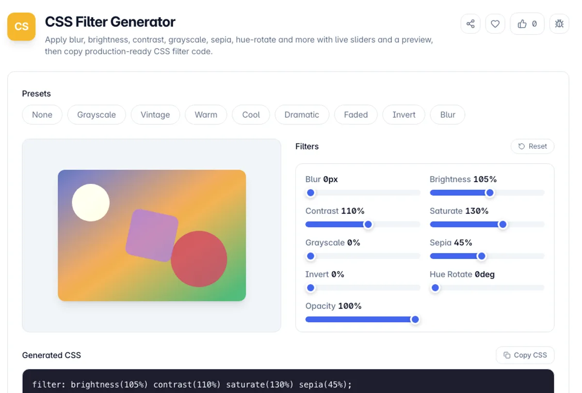
The CSS Filter Generator is a visual editor for the CSS filter property. You move a slider for each filter function - blur, brightness, contrast, saturate, grayscale, sepia, invert, hue-rotate, and opacity - and watch the effect apply to a preview in real time, then copy the exact CSS it produces.
The filter property applies graphical effects like blurring, colour shifting, and contrast adjustment directly in the browser, with no image editor required. Multiple functions can be chained in a single declaration and are applied in order, which is how photo-style looks such as vintage, warm, and dramatic are built. This tool manages that chain for you and outputs only the functions you changed, keeping the CSS clean.
Everything happens in your browser. The page opens on the Vintage preset; pick another preset, fine-tune each function, and copy the declaration. No account, no uploads, and it keeps working offline once the page has loaded.
Here is the CSS filter generator on a warm photo look. Click the Warm preset and Generated CSS reads filter: brightness(105%) saturate(140%) sepia(25%); with the preview shifting toward amber. Drag Blur to 2px and the line becomes filter: blur(2px) brightness(105%) saturate(140%) sepia(25%);. Click None, or press Reset, and it returns to filter: none;. Because the preview is a fixed colour sample rather than your own photo, check the copied CSS on the real image before you ship it.
Filters apply in the order written, and the order changes the result: grayscale then sepia is not the same as sepia then grayscale, because the first removes the colour the second would tint. The gotcha worth knowing is structural rather than visual. Any element with a filter other than none becomes a containing block for its fixed and absolutely positioned descendants, so a dropdown or modal inside a filtered parent will position itself against that parent instead of the viewport. It also creates a new stacking context, which can break z-index ordering that worked before. If a filter breaks a layout in a way that looks unrelated to appearance, that is almost always why. Filters are GPU-accelerated in most browsers, but large blur radii on large elements remain expensive. This tool always writes the functions in one fixed order, blur first and opacity last, so it cannot produce sepia before grayscale; reorder the functions by hand after copying if you need that.
How to use the CSS Filter Generator?
Pick a preset or start clean
The page opens on Vintage. Choose another preset such as Warm, Cool, Dramatic, or Grayscale for an instant look, or click None to start with no filters applied.
Adjust the filter sliders
Drag the blur, brightness, contrast, saturate, grayscale, sepia, invert, hue-rotate, and opacity sliders. The preview updates instantly so you can dial in the exact look.
Combine functions
Layer several functions together - for example sepia plus contrast plus saturate for a warm film look. The tool writes them in a fixed order: blur, brightness, contrast, saturate, grayscale, sepia, invert, hue-rotate, opacity.
Copy the CSS
Copy the generated filter declaration, which includes only the functions you changed, and paste it onto any element or image in your stylesheet.
Key Features
Nine Filter Functions
Blur, brightness, contrast, saturate, grayscale, sepia, invert, hue-rotate, and opacity each have a dedicated slider. drop-shadow() is not included
Minimal Output
Only the functions you change are written to the declaration, so you never ship redundant identity values like brightness(100%)
Live Preview
A preview updates instantly as you drag, so you can see the combined effect of every filter before copying a single line of CSS
Photo-Style Presets
Curated recipes for vintage, warm, cool, dramatic, faded, grayscale, invert, and blur give you a proven starting point instead of a blank canvas
Frequently Asked Questions
Related Tools
CSS Transform Generator
Build a CSS transform from translate, rotate, scale, skew and 3D perspective with live sliders and a preview, then copy production-ready code.
CSS Glassmorphism Generator
Create frosted-glass UI with a live preview and sliders for backdrop blur, transparency, saturation, color, and radius - then copy production-ready CSS.
CSS Neumorphism Generator
Create soft-UI (neumorphic) elements with a live preview and controls for distance, blur, intensity, radius, surface color, and flat/concave/convex/pressed shapes - then copy the CSS.
CSS Text Shadow Generator
Design layered CSS text-shadows with a live preview and sliders for offset, blur, color, and opacity - build glow, outline, retro 3D, and emboss effects, then copy production-ready CSS.
Comments
0 comments
No comments yet. Be the first to share your thoughts!