box-shadow: 0px 4px 6px -1px #0000001a, 0px 2px 4px -2px #0000001a;What is the CSS Box Shadow Generator?
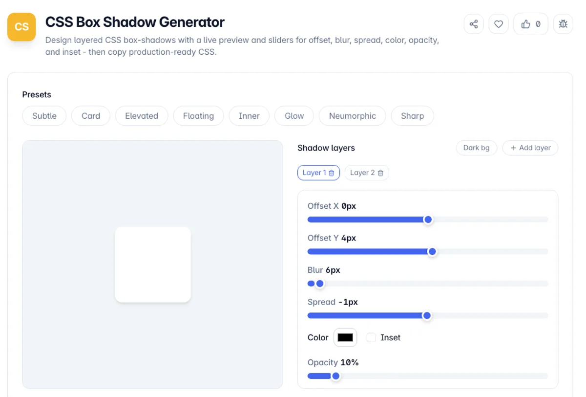
The CSS Box Shadow Generator is a visual editor for the CSS box-shadow property. You adjust offset, blur radius, spread radius, color, and opacity with sliders and see the result render live on a preview element, then copy the exact CSS. Instead of guessing pixel values and reloading the page, you shape the shadow directly and read the code it produces.
Open this CSS box shadow generator and it starts on the Card preset, two layers that copy as box-shadow: 0px 4px 6px -1px #0000001a, 0px 2px 4px -2px #0000001a;. The Opacity slider is baked into the hex color, so 10% becomes the 1a at the end. Click the Inner preset and the declaration changes to box-shadow: inset 0px 2px 4px 0px #00000033;, the pressed-button look. Add layer appends a shadow at 0px 4px 6px 0px #00000033, listed last and painted beneath the others.
The box-shadow property is deceptively deep. A single declaration can stack several shadows, each with its own offsets, blur, spread, color, and an optional inset keyword that paints the shadow inside the element rather than outside. Real interface shadows almost always use two or more layers to look natural, which is tedious to hand-write. This tool manages the layers for you and outputs a spec-valid declaration in the correct comma-separated order.
Everything happens in your browser. Pick a preset, tune the layers, switch the preview between light and dark backgrounds, and copy either the standard property or a block that also includes the -webkit- prefix. No account, no uploads, and it keeps working offline once the page has loaded.
Shadows are painted outside the box and take up no space, so they never push neighbours around and will be clipped by any ancestor with overflow hidden. Spread is the least understood value: it grows or shrinks the shadow shape before blurring, so a positive spread with zero blur gives a solid offset outline, which is how border effects are faked without affecting layout. Inset moves the shadow inside the element, useful for pressed states and inner glows. Layering several shadows with increasing offset and blur is how convincing depth is built, since a single large blur reads as fog rather than as a shadow. Each layer costs rendering time, and shadows that repaint during scroll or animation are a common source of jank on lower-powered devices.
How to use the CSS Box Shadow Generator?
Start from a preset or blank layer
The page opens on the Card preset. Pick another such as Elevated or Neumorphic for a different starting point, or edit the current layers directly.
Tune the shadow with sliders
Drag the horizontal and vertical offset, blur radius, and spread radius sliders, set the shadow color and opacity, and tick Inset to move the shadow inside the box.
Stack more layers if needed
Click Add layer for depth - a soft wide shadow under a tighter darker one reads as natural elevation. New layers go at the end, which paints them beneath earlier ones; there is no reordering, so to move a layer, delete it with its trash icon and rebuild it with Add layer.
Copy the CSS
Copy the box-shadow declaration, or the prefixed block for older browsers, and paste it straight into your stylesheet or component styles.
Key Features
Multi-Layer Shadows
Stack any number of shadow layers into one declaration, in the correct top-to-bottom paint order, which is how real card and modal elevation is built
Full Property Control
Sliders for horizontal and vertical offset, blur radius, and spread radius, plus a color picker, an opacity control, and an inset toggle cover every part of the grammar
Live Preview
A preview element updates instantly as you edit, and you can switch its background between light and dark to check how the shadow reads in both themes
Ready-Made Presets
Curated recipes for subtle, card, elevated, floating, inner, glow, neumorphic, and sharp shadows give you a proven starting point instead of a blank canvas
Frequently Asked Questions
Related Tools
CSS Border Radius Generator
Round any corner with a live preview and per-corner sliders, switch between px, %, em, and rem, and copy the shortest valid CSS border-radius.
CSS Clamp Generator
Generate fluid, responsive CSS clamp() values that scale between viewports
CSS Unit Converter
Convert between CSS units - px, rem, em, pt and % - with a configurable root font size, instant all-units output, and a px-to-rem reference table for responsive typography.
Flexbox Generator
Build CSS flexbox layouts visually. Adjust justify-content, align-items, direction, wrap and gap with a live preview, then copy the generated CSS - all in your browser.
Comments
0 comments
No comments yet. Be the first to share your thoughts!