.gradient {
  background: linear-gradient(to right, #667eea 0%, #764ba2 100%);
}background: linear-gradient(to right, #667eea 0%, #764ba2 100%);What is CSS Gradient Generator?
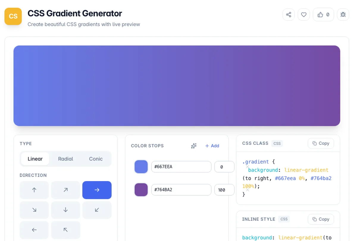
CSS Gradient Generator is a free online tool that lets you create beautiful CSS gradients with a visual interface and live preview. It supports linear, radial, and conic gradient types, allowing you to design stunning color transitions for website backgrounds, buttons, cards, and other UI elements.
The tool provides an intuitive drag-and-drop interface for adding and positioning color stops, adjusting gradient direction and angle, and fine-tuning opacity. You can see exactly how your gradient will look in real-time, making it easy to experiment with different color combinations until you achieve the perfect result.
Once you are satisfied with your gradient, simply copy the generated CSS code and paste it into your stylesheet. The tool outputs clean, cross-browser-compatible CSS that works in all modern browsers. No design or coding expertise is needed to create professional-looking gradients.
One thing to know about how browsers draw gradients: colours are interpolated in sRGB, which is not perceptually even. Blending two strongly opposed colours, blue to yellow being the classic case, takes the midpoint through a desaturated grey that neither end colour suggests. The usual fixes are to add a stop in the middle to steer the path, or to pick end colours closer together on the wheel. Repeating a stop at the same position produces a hard edge rather than a blend, which is how stripe and band effects are built. Vendor prefixes are no longer needed for standard gradients in any browser still receiving updates, so the shortest output is also the most compatible. Gradients are painted as backgrounds, so they need a box with dimensions to be visible at all.
How to use CSS Gradient Generator?
Choose gradient type
Select between linear, radial, or conic gradient types. Each type creates a different kind of color transition effect.
Add color stops
Click to add color stops and choose colors for each stop. Drag them to adjust their position along the gradient.
Adjust direction and angle
Set the gradient direction or angle for linear gradients, or the center position for radial gradients to control how colors flow.
Copy the CSS code
Copy the generated CSS code with one click and paste it directly into your stylesheet. The code is ready to use in any web project.
Key Features
Class and Inline Output
The gradient is emitted both as a CSS rule and as a bare background declaration for an inline style, each with its own copy button
Multiple Gradient Types
Create linear, radial, and conic gradients with full control over direction, angle, and shape
Live Visual Preview
See your gradient update in real-time as you adjust colors, stops, and directions
One-Click CSS Copy
Copy clean, cross-browser CSS code ready to paste into your stylesheets
Frequently Asked Questions
Related Tools
CSS Border Radius Generator
Round any corner with a live preview and per-corner sliders, switch between px, %, em, and rem, and copy the shortest valid CSS border-radius.
CSS Clamp Generator
Generate fluid, responsive CSS clamp() values that scale between viewports
CSS Unit Converter
Convert between CSS units - px, rem, em, pt and % - with a configurable root font size, instant all-units output, and a px-to-rem reference table for responsive typography.
Flexbox Generator
Build CSS flexbox layouts visually. Adjust justify-content, align-items, direction, wrap and gap with a live preview, then copy the generated CSS - all in your browser.
Comments
0 comments
No comments yet. Be the first to share your thoughts!