background: rgba(255, 255, 255, 0.2);
backdrop-filter: blur(10px) saturate(120%);
-webkit-backdrop-filter: blur(10px) saturate(120%);
border-radius: 16px;
border: 1px solid rgba(255, 255, 255, 0.18);
box-shadow: 0 8px 32px rgba(0, 0, 0, 0.12);What is the CSS Glassmorphism Generator?
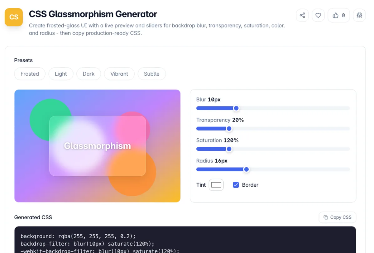
The CSS Glassmorphism Generator is a visual editor for the frosted-glass UI style, where a translucent surface blurs whatever sits behind it. You adjust backdrop blur, fill transparency, saturation, tint color, and corner radius with sliders, watch a preview update over a colourful background, and copy the exact CSS it produces.
Glassmorphism relies on the backdrop-filter property, which applies a blur to the content behind an element rather than the element itself. Combined with a semi-transparent background, a hairline border, and a soft shadow, it produces the layered glass look popularised by modern operating systems. Getting the balance right by hand is fiddly, so this tool manages every value and outputs a clean, copyable block.
Everything runs in your browser. Pick a preset like Frosted, Dark, or Vibrant, fine-tune the sliders, and copy the CSS - including the -webkit- prefixed backdrop-filter for wider support. No account, no uploads, and it keeps working offline once the page has loaded.
The effect depends on two properties working together, and it fails silently if either is missing. Backdrop-filter blurs whatever sits behind the element, so it needs a partly transparent background colour to show through: at full opacity there is nothing to see, and with no background at all the surface disappears. It also needs something behind it worth blurring, which is why the effect looks like a flat panel over a plain background and comes alive over a photograph. Two practical costs. Backdrop blur is one of the more expensive things to composite, particularly over a large area or during scrolling. And text on a translucent surface has a contrast ratio that changes with whatever passes underneath, so it can pass a contrast check against one background and fail against another.
As a glassmorphism CSS generator, it starts from the Frosted preset, and the copied block for that preset reads: background: rgba(255, 255, 255, 0.2); backdrop-filter: blur(10px) saturate(120%); the same value again as -webkit-backdrop-filter; border-radius: 16px; border: 1px solid rgba(255, 255, 255, 0.18); and box-shadow: 0 8px 32px rgba(0, 0, 0, 0.12). Click Dark and the background changes to rgba(15, 23, 42, 0.25) with a 12px blur, which is the version to use over a light photo.
How to use the CSS Glassmorphism Generator?
Pick a preset
Start from Frosted, Light, Dark, Vibrant, or Subtle to get a balanced glass look, then refine it to match your design.
Tune the glass
Drag the backdrop blur, transparency, and saturation sliders, choose a tint color, and set the corner radius. The preview updates live over a colourful backdrop so the blur is visible.
Toggle the border
Turn the hairline border on or off. A subtle 1px translucent-white border sells the glass edge, especially on darker backgrounds.
Copy the CSS
Copy the generated block - background, backdrop-filter (with -webkit- prefix), border-radius, border, and shadow - and paste it onto your card or panel.
Key Features
Backdrop Blur Control
A dedicated blur slider drives the backdrop-filter, which frosts whatever sits behind the element - the core of the glass effect
Full Surface Styling
Transparency, saturation, tint color, corner radius, and an optional hairline border let you dial in the exact glass look
Live Preview
The preview sits over a colourful gradient so you can see the backdrop blur working, updating instantly as you edit
Prefixed Output
Output includes both backdrop-filter and the -webkit-backdrop-filter prefix, so the effect works across Safari and other WebKit browsers
Frequently Asked Questions
Related Tools
CSS Filter Generator
Apply blur, brightness, contrast, grayscale, sepia, hue-rotate and more with live sliders and a preview, then copy production-ready CSS filter code.
CSS Transition Generator
Build a CSS transition from property, duration, timing function and delay with a live hover preview, then copy production-ready code. Supports multiple layers.
CSS Neumorphism Generator
Create soft-UI (neumorphic) elements with a live preview and controls for distance, blur, intensity, radius, surface color, and flat/concave/convex/pressed shapes - then copy the CSS.
CSS Text Shadow Generator
Design layered CSS text-shadows with a live preview and sliders for offset, blur, color, and opacity - build glow, outline, retro 3D, and emboss effects, then copy production-ready CSS.
Comments
0 comments
No comments yet. Be the first to share your thoughts!