border-radius: 24px;
background: #e0e0e0;
box-shadow: 12px 12px 24px #bababa, -12px -12px 24px #ffffff;What is the CSS Neumorphism Generator?
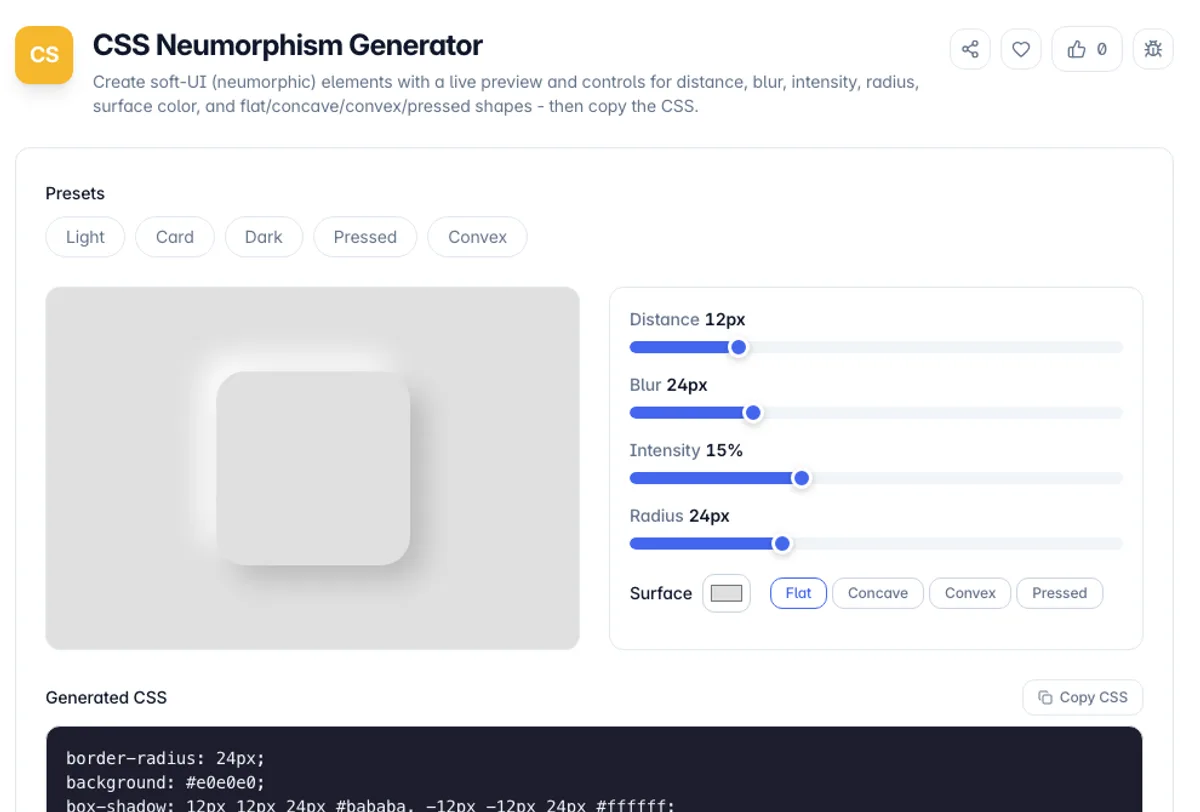
The CSS Neumorphism Generator builds soft-UI elements - the style where a shape looks gently extruded from or pressed into the background using paired light and dark shadows. You set the surface color, shadow distance, blur, contrast intensity, corner radius, and shape, watch a live preview, and copy the exact CSS.
Neumorphism works by placing two box-shadows on an element that shares its background with the page: a lighter shadow on the top-left and a darker one on the bottom-right. Getting the two shadow colors and offsets to look convincingly soft is finicky by hand. This tool derives the light and dark shades from your surface color automatically, so the effect always looks balanced.
Everything runs in your browser. Pick a preset, adjust the sliders, switch between flat, concave, convex, and pressed shapes, and copy the CSS. No account, no uploads, and it keeps working offline once the page has loaded.
Neumorphism is worth using with clear eyes about its main weakness, which is accessibility. The style works by placing a light shadow and a dark shadow on a surface almost the same colour as its background, so the edge of a control is defined by a difference of a few per cent in luminance. That reads as elegant to some viewers and as invisible to anyone with reduced contrast sensitivity, on a dim screen, or outdoors. It fails WCAG 1.4.11, which asks for a 3:1 ratio on the boundary of an interactive component. The usual compromise is to keep the style for decorative surfaces and give genuinely interactive elements a real border or a clear focus state. Shadow colours are derived from the surface colour here, so a dark surface produces a correctly inverted pair rather than a grey one.
How to use the CSS Neumorphism Generator?
Set the surface color
Choose the color of your element, which should match the page background behind it - neumorphism relies on the element and page sharing the same base color.
Tune the shadows
Adjust distance, blur, and intensity to control how far the element lifts off the page and how strong the light/dark contrast is.
Pick a shape
Switch between flat, concave, convex, and pressed. Pressed uses inset shadows to look sunken, while concave and convex add a subtle gradient.
Copy the CSS
Copy the generated block - border-radius, background, and the paired box-shadow - and paste it onto your card, button, or panel.
Key Features
Automatic Shadow Colors
The light and dark shadow shades are derived from your surface color, so the soft-UI effect always looks balanced without manual tweaking
Four Shapes
Flat, concave, convex, and pressed cover raised and sunken looks, with pressed using inset shadows and concave/convex adding a subtle gradient
Full Control
Sliders for shadow distance, blur, contrast intensity, and corner radius let you dial the effect from barely-there to dramatic
Live Preview
The preview sits on a matching background so the soft shadows read correctly, updating instantly as you edit
Frequently Asked Questions
Related Tools
CSS Filter Generator
Apply blur, brightness, contrast, grayscale, sepia, hue-rotate and more with live sliders and a preview, then copy production-ready CSS filter code.
CSS Glassmorphism Generator
Create frosted-glass UI with a live preview and sliders for backdrop blur, transparency, saturation, color, and radius - then copy production-ready CSS.
CSS Text Shadow Generator
Design layered CSS text-shadows with a live preview and sliders for offset, blur, color, and opacity - build glow, outline, retro 3D, and emboss effects, then copy production-ready CSS.
Credit Card Validator
Check a credit card number against the Luhn checksum and detect its card network. Validates the format only, never contacts a bank.
Comments
0 comments
No comments yet. Be the first to share your thoughts!