border-radius: 16px;What is the CSS Border Radius Generator?
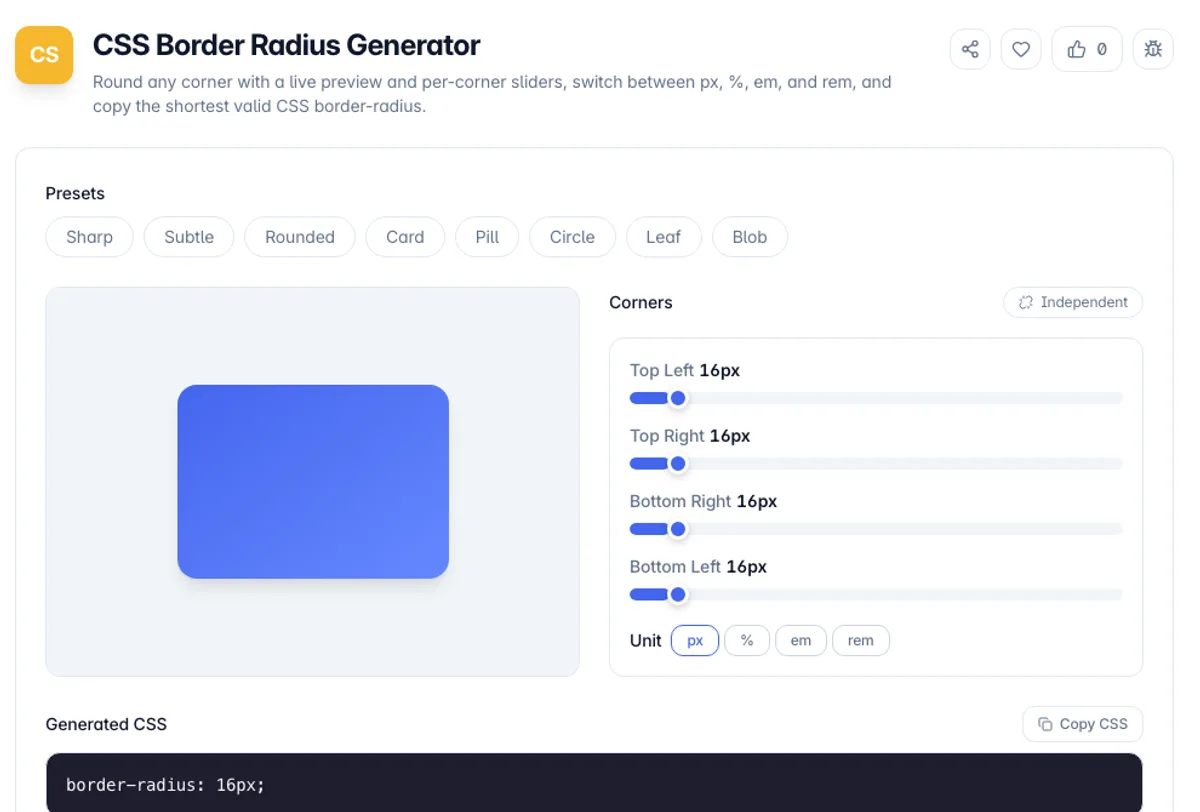
The CSS Border Radius Generator is a visual editor for the CSS border-radius property. You drag a slider for each corner, watch a preview element round in real time, and copy the exact CSS it produces - no guessing pixel values and reloading the page.
The border-radius property looks simple but has a compact shorthand that trips people up: one value rounds all four corners, two values set the two diagonals, and four values run clockwise from the top-left. This tool lets you set each corner independently and then outputs the shortest equivalent shorthand automatically, so your CSS stays clean.
Everything runs in your browser. Start from a preset like Card, Pill, Circle, or Blob, fine-tune each corner, switch the unit between pixels and percentages, and copy the declaration. No account, no uploads, and it keeps working offline once the page has loaded.
Percentages and pixels behave differently on anything that is not square, and the difference surprises people. A pixel radius is the same curve on every corner, while a percentage is measured against each axis separately, so 50 per cent on a wide box gives an ellipse rather than a circle. That is the property that turns a rectangle into a pill or a lens shape. The specification also protects you from impossible geometry: when the radii along one edge add up to more than the length of that edge, the browser scales every radius on the element down proportionally rather than overlapping them, so a large value quietly stops growing. Output uses the shortest valid shorthand, which is why four equal corners collapse to a single number.
As a border-radius CSS generator, the useful part is that it does the shorthand arithmetic for you. Set Top Left and Bottom Right to 24 and Top Right and Bottom Left to 8, in px, and the output reads border-radius: 24px 8px; because the diagonal pairs match. Drop Bottom Right to 0 and it becomes the three-value 24px 8px 0px, since Top Right and Bottom Left still match. You can check each result against the preview before copying, which is what a CSS border radius generator is for.
How to use the CSS Border Radius Generator?
Pick a preset or start fresh
Choose a preset such as Rounded, Pill, Circle, or Blob for an instant starting point, or begin from the default rounded corners.
Adjust each corner
Drag the top-left, top-right, bottom-right, and bottom-left sliders to round each corner independently, or set them all to the same value for a uniform radius.
Choose a unit
Switch between px, %, em, and rem. Percentages create elliptical corners relative to the element size - set 50% on all corners to make a perfect circle or ellipse.
Copy the CSS
Copy the generated border-radius declaration, already collapsed to the shortest valid shorthand, and paste it into your stylesheet.
Key Features
Per-Corner Control
Independent sliders for all four corners let you build asymmetric shapes like leaf, tab, and speech-bubble radii, not just uniform rounding
Shortest Valid Output
The tool collapses your four corners to the shortest equivalent border-radius shorthand automatically, keeping your CSS clean and readable
Multiple Units
Switch between px, %, em, and rem - percentages produce elliptical corners relative to the box size, which is how circles and blobs are made
Live Preview
A preview element updates instantly as you drag, so you can see exactly how the corners round before you copy anything
Frequently Asked Questions
Related Tools
CSS Box Shadow Generator
Design layered CSS box-shadows with a live preview and sliders for offset, blur, spread, color, opacity, and inset - then copy production-ready CSS.
CSS Clamp Generator
Generate fluid, responsive CSS clamp() values that scale between viewports
Flexbox Generator
Build CSS flexbox layouts visually. Adjust justify-content, align-items, direction, wrap and gap with a live preview, then copy the generated CSS - all in your browser.
CSS Gradient Generator
Create beautiful CSS gradients with live preview
Comments
0 comments
No comments yet. Be the first to share your thoughts!